 Decision-makers are always under intense pressure. They often have to process tons of information over a short time to make these decisions. In many cases, the information comes in raw numbers and spreadsheets, which can be overwhelming.
All of that is changing these days thanks to data visualization. Business decision makers in various sectors no long have to sift through tons of data. They can digest complex information faster by looking at images.
Why Is Data Visualization So Effective?
Data visualization is so effective because the brain can process images within 13 milliseconds according to MIT. Other researchers in the University of Minnesota found that the brain processes visuals 60,000 times faster than text.
Therefore, data visualization is so effective because it drastically shortens the length of time it should take a decision-maker to digest and understand raw data.
Various Data Visualization Techniques
The most common data visualization techniques in use today include the following.
The Use of Charts and Graphs
Line charts, bar graphs, pie charts, candlestick charts, and scatter plots have long been the mainstay of data visualization tools and continue to remain relevant to date. They help present datasets in a condensed image. Looking at the image, you can see trends over time or the relationship between different variables.
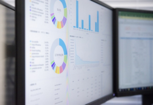
The Use of Dashboards
While graphs and charts present specific information in distinct images, dashboards show multiple charts and graphs in a single interface. They are the best for visualizing key performance indicators (KPIs) and other important metrics at a glance.
This is why dashboards are the preferred choice for executives and managers in roles that require real-time monitoring. Some dashboards have interactive components built-in which allow users to filter information or customize the visualization to meet specific needs.
The Benefits of Data Visualization
Data visualization supports strategic planning and helps improve business outcomes in the following ways.
Identify Trends and Relationships
Data visualization helps business decision-makers see growth patterns and trends, correlations, and other information. It’s also great for identifying outliers. This allows them to predict future performance quickly, ensuring more proactive decision-making.
Monitor KPIs
Live data visualization tools can allow businesses monitor key performance indicators and the progress of projects better. This allows them to identify areas that need improvement quickly.
Better Data Communication and Stakeholder Engagement
Complex datasets are hard to digest and communicate via text alone. Data visualization allows decision-makers to evaluate complex information and share easy-to-understand details with other relevant stakeholders, department heads, and others.
More Strategic Planning
Data visualization simplify forecasts and trend analysis. Therefore, strategies built on the results of the visualized data will likely have more positive impact than those built on gut-feeling or poorly translated or understood data.
Better Risk Management
Data visualization can show businesses areas of concern at a glance, allowing them to take proactive measures toward mitigating them.
Improved Productivity
When key decision-makers don’t have to spend too much time on data analysis, they can allocate more resources to taking action and making strategic decisions more likely to move the needle and improve the bottom line.